The Elements of Design: Color—Using it in the Garden & Vase
Whether you’re designing a garden border, planting a cutting garden, or arranging flowers in a vase, every successful design is built upon a few fundamental principles.
They are known as the elements of design: color, form, line, texture, and space.
Think of these elements as the building blocks of design. Just as an artist uses paint and a musician uses notes, gardeners and floral designers use these elements to create beauty, evoke emotion, and tell a story.
We’ll be talking through each element, but in this first article, we’ll explore perhaps the most powerful element of all: color.
Why Color Matters
Color is often the first thing we notice in a garden or floral arrangement. Long before we register individual flowers, textures, or shapes, the overall color palette draws us in and establishes the mood.
A design filled with bright oranges, hot pinks, and sunny yellows feels energetic and joyful. A palette of burgundy, plum, and deep chocolate tones feels dramatic and sophisticated. Soft blush, lavender, and cream create a romantic, calming atmosphere.
Before choosing a single flower, it can be helpful to ask:
How do I want this space to feel?
What emotion do I want this arrangement to evoke?
What story am I trying to tell?
The answers will guide your color choices.
Developing a Color Story
Designers often speak of creating a color story.
A color story is simply a cohesive palette that unifies a design and creates a consistent mood.
Some common color stories include:
Vibrant & Energetic
Think zinnias, sunflowers, celosia, and bright dahlias.
Colors:
Orange
Yellow
Hot Pink
Bright Red
This palette feels cheerful, playful, and full of life.
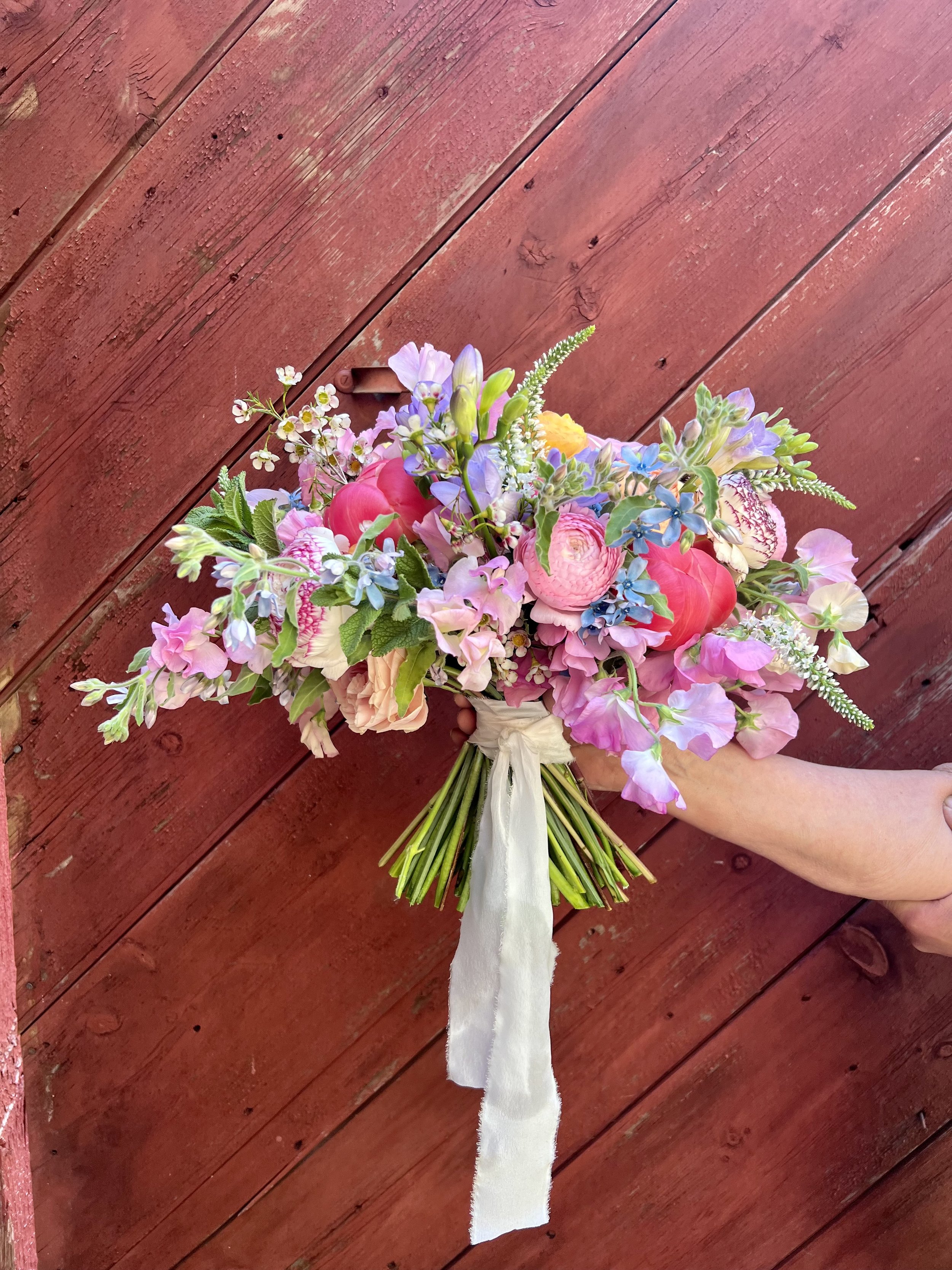
Soft & Romantic
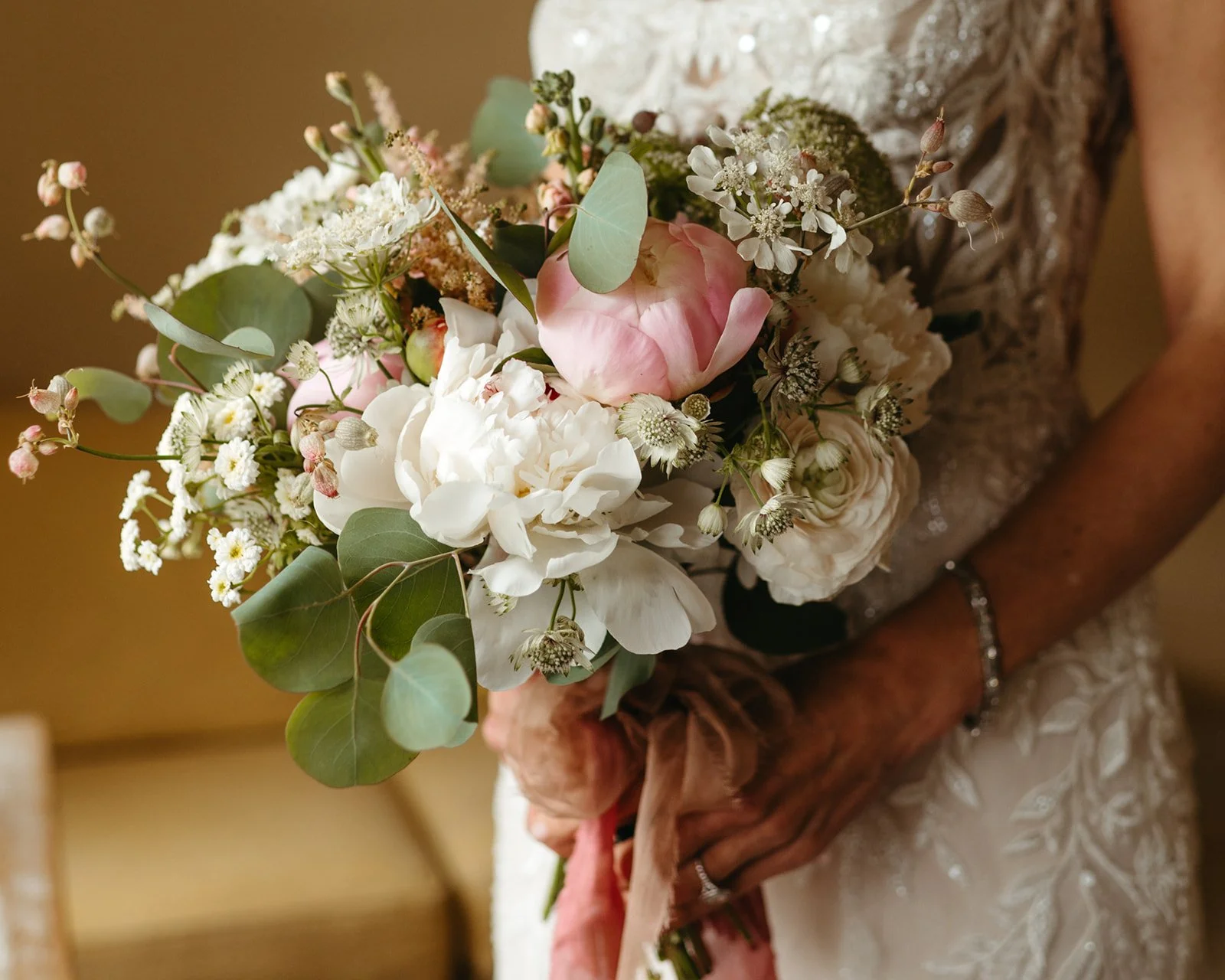
Think garden roses, sweet peas, cosmos, and lisianthus.
Colors:
Blush
Cream
Lavender
Soft Peach
This palette feels gentle, timeless, and elegant.
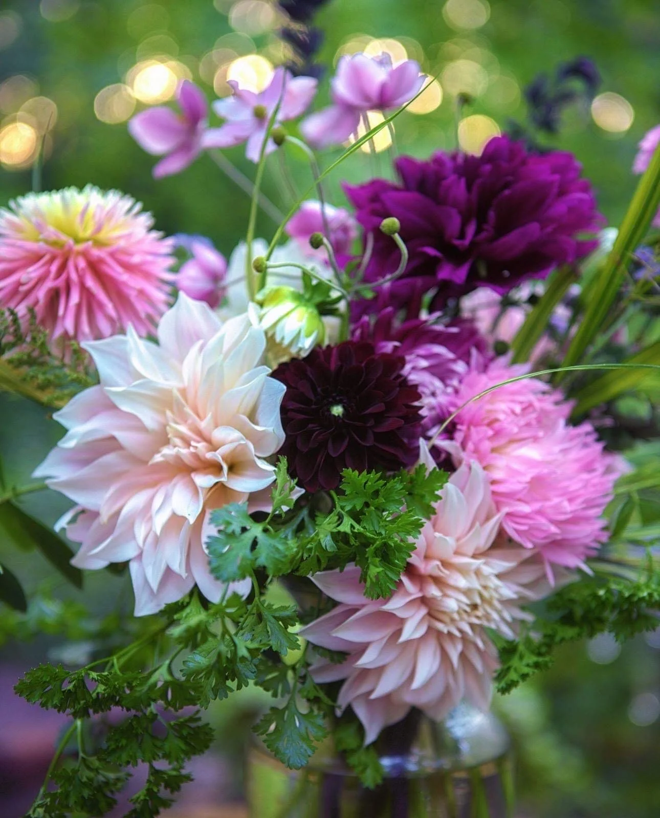
Moody & Dramatic
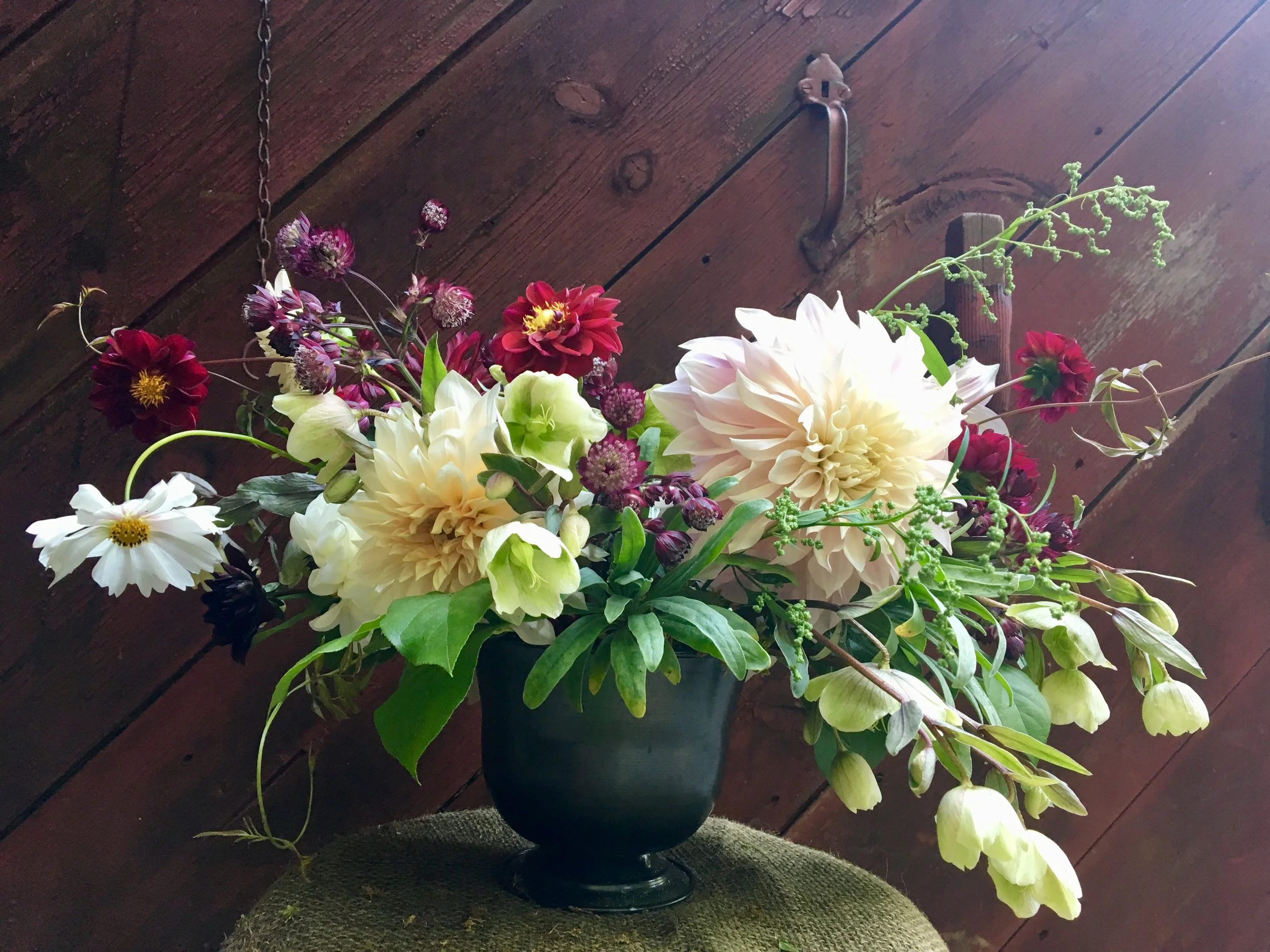
Think dark dahlias, scabiosa, smoke bush, and burgundy foliage.
Colors:
Deep Burgundy
Plum
Chocolate
Dusty Mauve
This palette feels luxurious, artistic, and sophisticated.
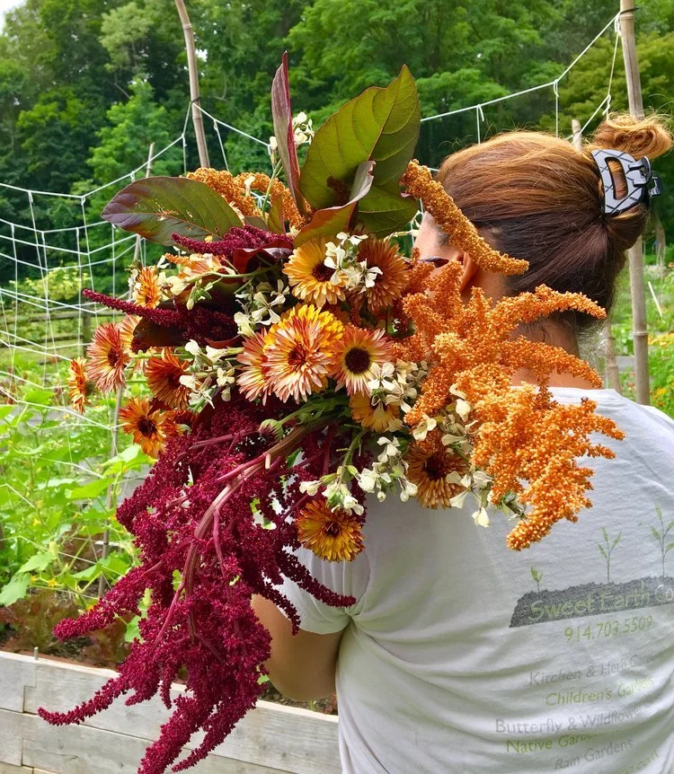
Jewel Tones
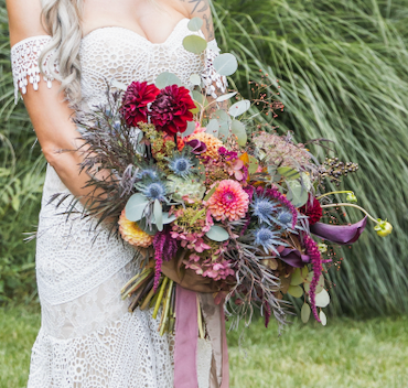
Think rich late-summer flowers and autumn abundance.
Colors:
Sapphire Blue
Emerald Green
Ruby Red
Amethyst Purple
This palette feels bold, rich, and opulent.
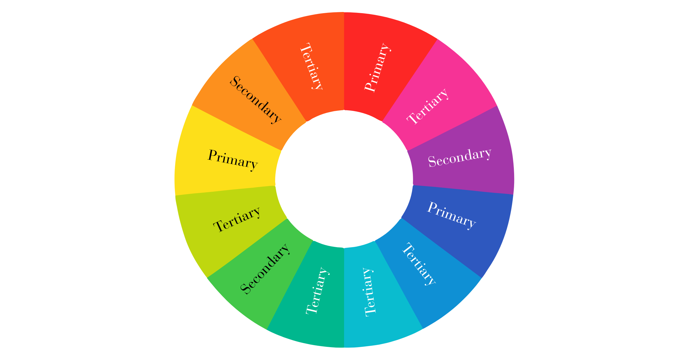
Understanding the Color Wheel
The color wheel is one of the most useful tools a designer can learn. At its simplest, it helps us understand how colors relate to one another.
Primary Colors
Red
Yellow
Blue
These cannot be created by mixing other colors.
Secondary Colors
Created by mixing primary colors:
Orange
Green
Purple
Tertiary Colors
Created by mixing a primary and secondary color. These create many of the nuanced shades we find in flowers and foliage.
Color Harmonies
Designers often use several classic color relationships.
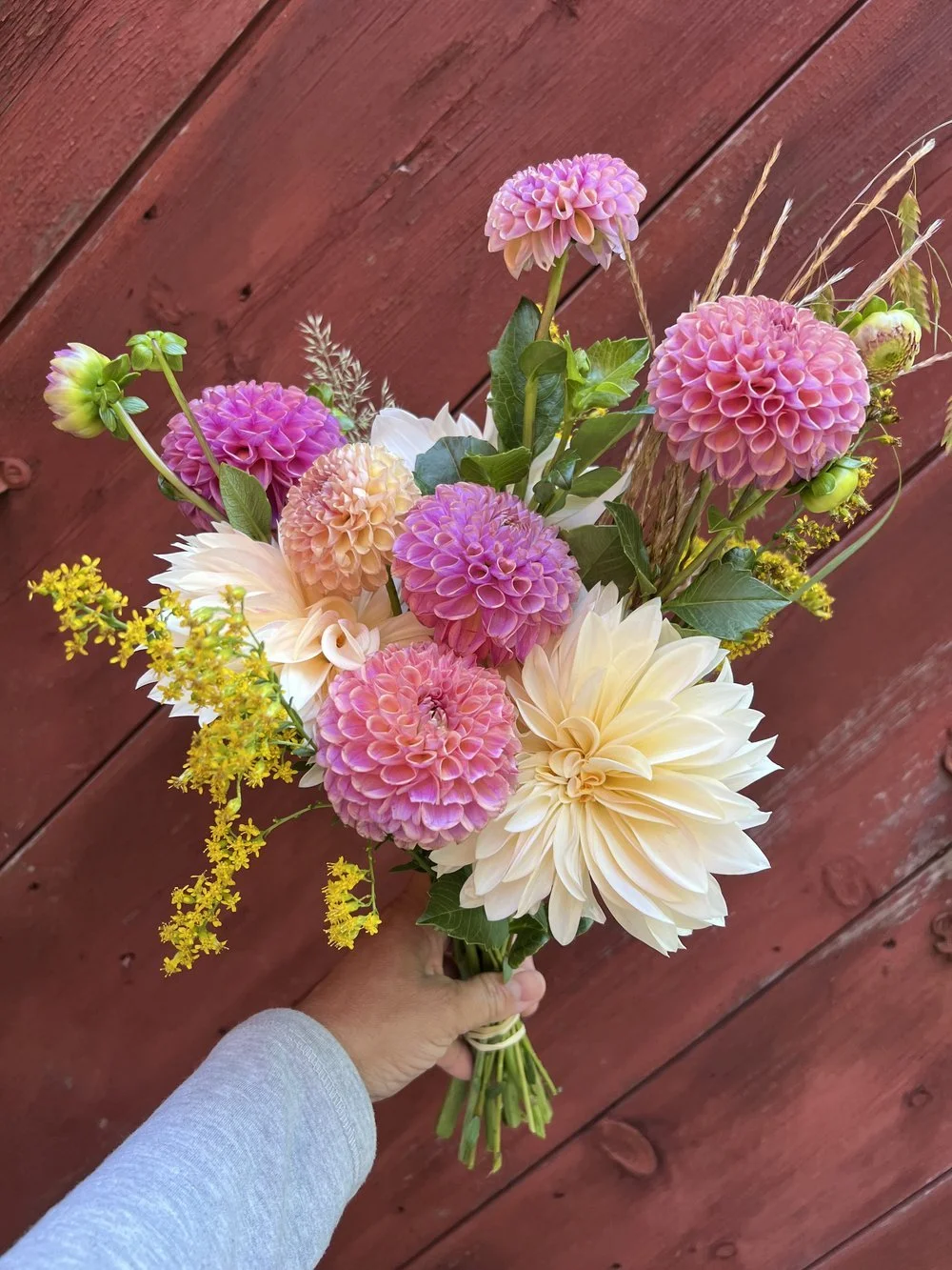
Monochromatic
Uses different shades and tints of a single color, like a bouquet of pale pink cosmos, blush garden roses, and deep raspberry dahlias.
This creates a sophisticated and calming effect.
Analogous
Uses colors that sit next to each other on the color wheel, like yellow, orange, and red or blue, violet, and purple.
These combinations feel natural and harmonious.
Complementary
Uses colors opposite each other on the color wheel, like purple and yellow, blue and orange, or red and green.
Complementary combinations create energy, excitement, and visual contrast.
Split Complementary
Uses one color plus the two colors adjacent to its complement. These palettes often feel dynamic while remaining balanced and approachable.
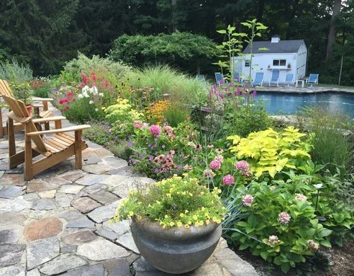
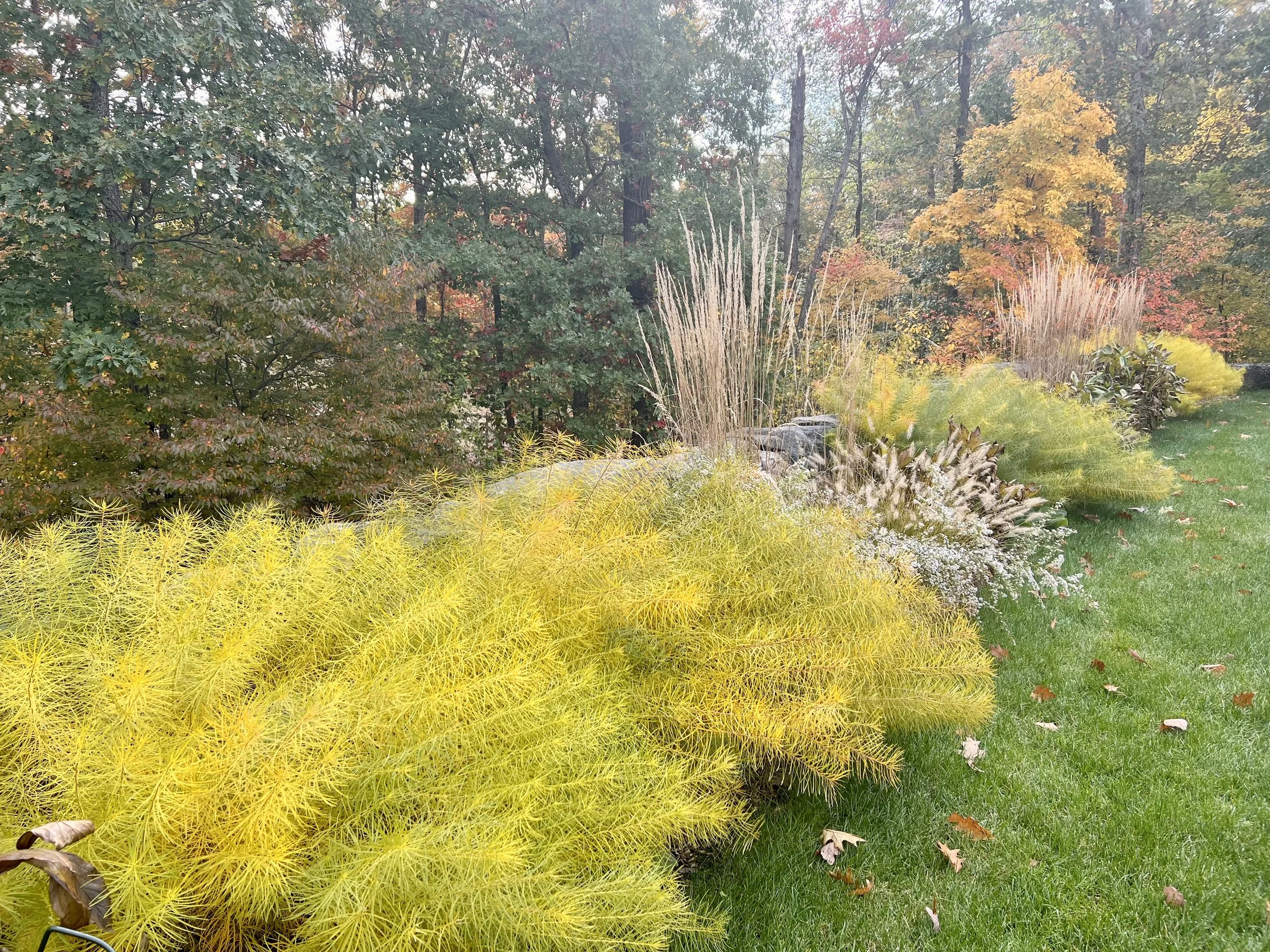
Using Color in the Garden
Many gardeners focus primarily on the bloom succession—making sure something is flowering throughout the season.
While that’s important, thoughtful color planning can elevate a garden from a collection of plants into a cohesive design.
Consider creating dedicated color zones within the garden:
A cool garden of blues, purples, and whites.
A pastel cutting garden for calming, peaceful bouquets.
A vibrant pollinator border filled with hot colors.
A moon garden featuring white and silver flowers that stand out at dusk.
Using Color in Floral Design
In floral design, color helps guide the viewer’s eye and establish the arrangement’s mood. One common mistake beginners make is including every beautiful flower they have available.
The result can feel visually chaotic.
Instead, choose a color story and allow it to guide your flower selection. For example, a summer arrangement might include:
Peach garden roses
Apricot zinnias
Cream lisianthus
Soft yellow yarrow
While each flower is different, the shared color palette creates harmony.
The goal is not necessarily matching colors perfectly, but ensuring they relate to one another in a meaningful way.
Keep these color guidelines in mind when designing your garden or arrangement:
→ Warm colors—reds, oranges, and yellows—tend to advance visually and attract attention.
→ Cool colors—blues, purples, and soft greens—appear to recede, creating a sense of depth and tranquility.
→ White can provide rest for the eye.
→ Dark colors add depth and drama.
→ Bright colors create focal points.

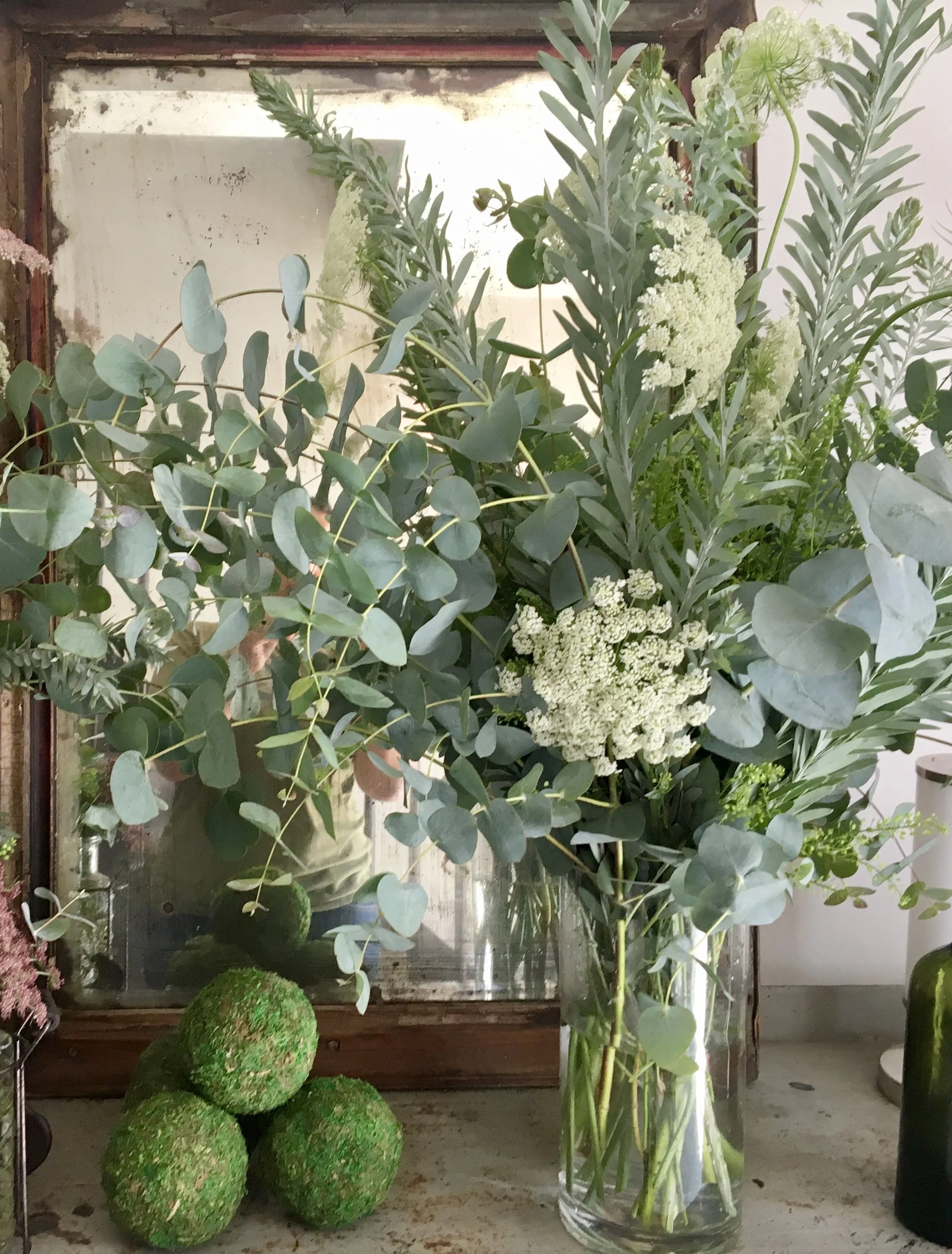
Looking Beyond Flowers
One of the most overlooked aspects of color design is foliage. Leaves, seed pods, branches, grasses, and even hardscape materials contribute to the overall palette.
Flowers may be the stars of the show, but foliage often provides the supporting cast that makes the color story successful.
Whether you’re planning a garden border, growing flowers for cutting, or arranging blooms for your kitchen table, understanding color allows you to move beyond simply choosing flowers you like and begin designing with intention.
In the next article, we’ll explore another essential element of design: form—the shapes and structures that give both gardens and floral arrangements their character and personality.
In the meantime, download our Better Bouquet guide for free to start practicing your floral design skills.